

Objective:
Create a stylized booklet of a particular typeface.
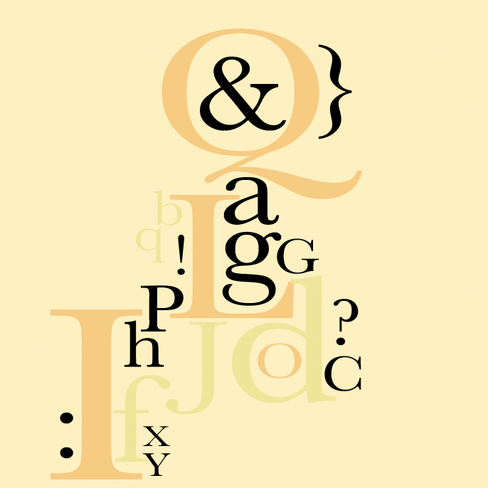
In my Typography II class we were assigned to create a twelve page booklet showcasing a specific typeface. I was lucky enough to work with the Typeface Baskerville and its font family.
My peers and I were encouraged to do plenty of research and come up with three compositions with a variety of styles. From there, I would receive feedback of which one would be the best out of the three to go forward with for the final booklet.
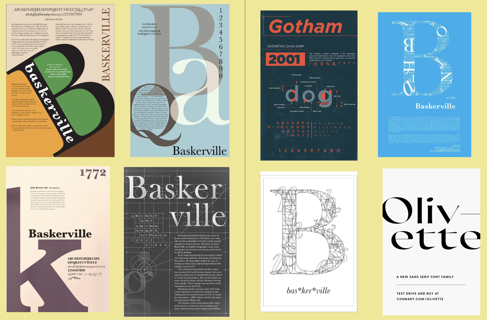
For research I looked mainly on Pinterest to see what has been done before since I strive to have unique ideas. I never want to copy from other designers, simply be inspired by them. I liked a lot of what I saw on Pinterest and created a board to refer back to. I also looked more broad on google images and designer blogs.
-
Sketches
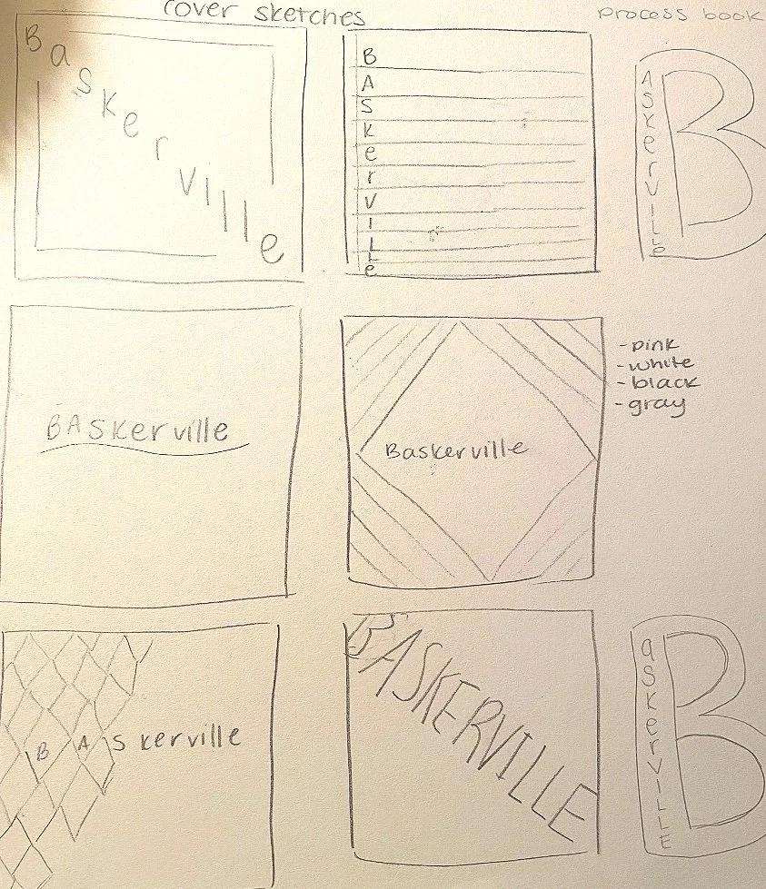
All starts with drawings of initial ideas before designing on screen.
-
Color Studies
Explored various color palettes I aimed to work with.
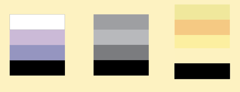
Afterwards I went on to use Adobe Indesign and illustrator to create the initial comps. I came up with these 3 different designs. I wanted to emphasize the “B” in Baskerville since this is a well-known typeface. I decided to dive deeper into the orange and yellow composition. The color swatch for this one is fun to work with and I take a liking to this combination which would make me more engaged to work on this rather than the black, white and gray design.
I went deeper into research on the typeface itself to add the appropriate history of where it began. The cover page is a big B that is cut off on purpose for the serif. I plan to use the three main colors for the majority of the pages so it’s cohesive and possesses variety. I never want redundant design to bore myself and the viewer. I had lots of fun playing with different styles. I developed a respect and love for Baskerville. It’s a simple serif typeface that I've used more often after this project.

Composition 1
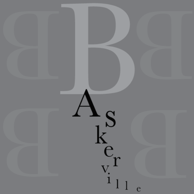
Composition 2

Composition 3

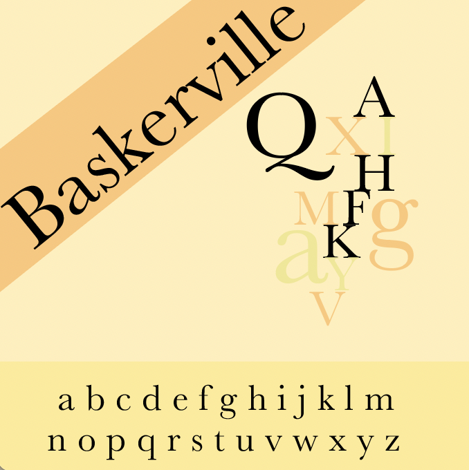
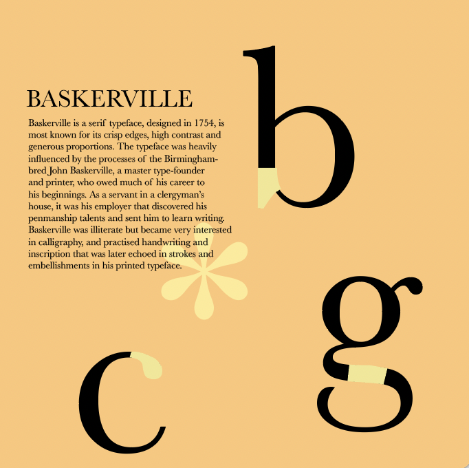
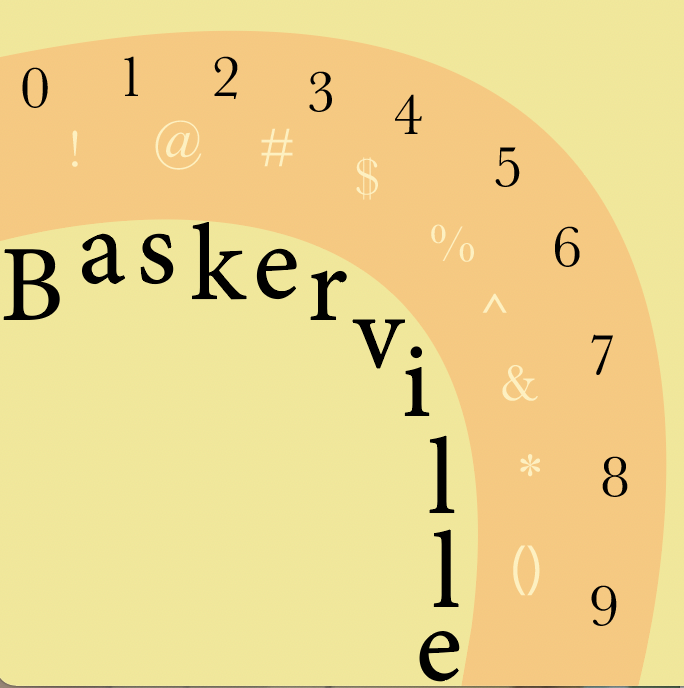
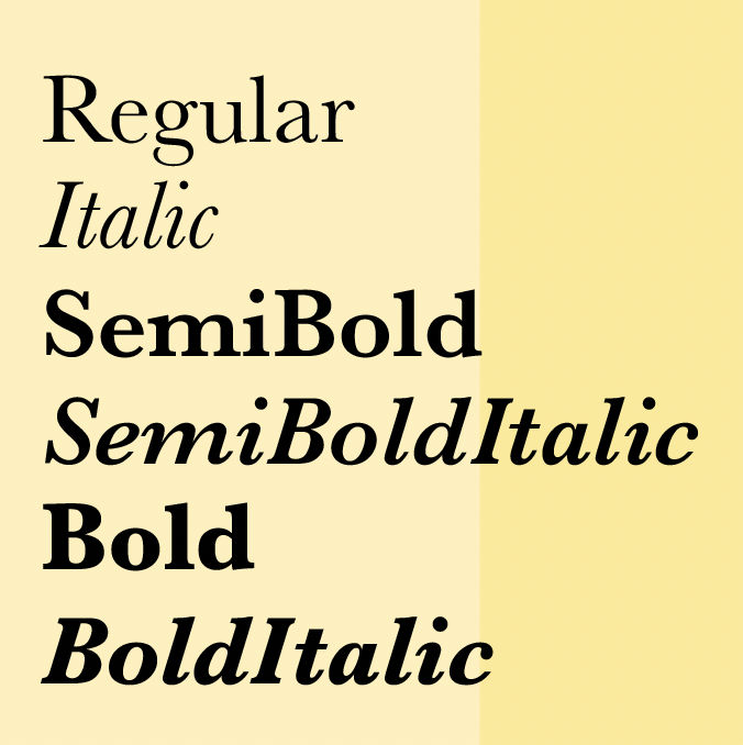
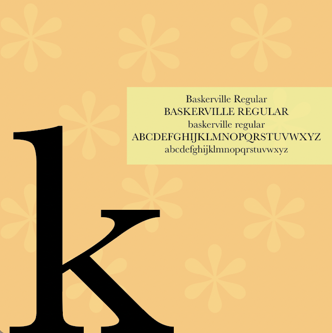
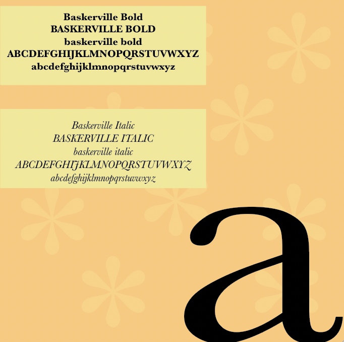
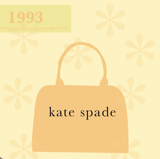
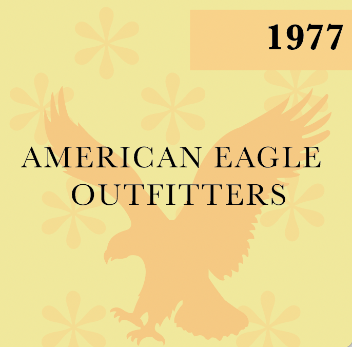

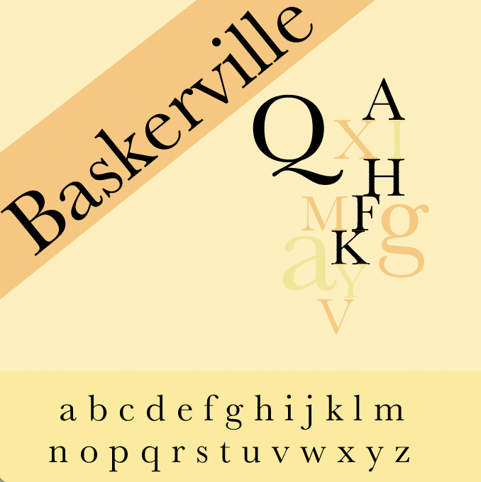
I display the lowercase alphabet on the second page as well as a combination of letters. I did this on multiple pages since it's eye-opening to see the letters in different sizes and colors all put together. I showcased big letters to fill empty space as well as show them off. I then got unique on page four with a curved shape to reveal the numbers and characters. I find it more fun than just flat across. The following page has the different styles of the font. I made the next four pages go together across rather than individual designs. I used the Baskerville asterice as a faded pattern for the background. In the foreground are the font family alphabets and large letters as well as showing which popular brands use Baskerville. Companies such as Kate Spade and American Eagle Outfitters.
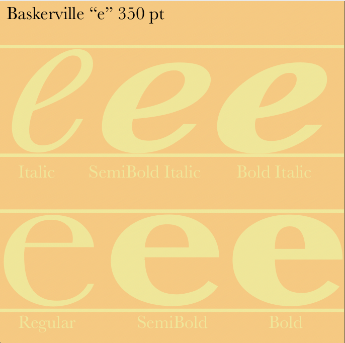
Pages 10-11 I used the letter “e” to show how they look different with the different styles of Baskerville. The 12th and final page is my favorite of all of them. I had lots of creative fun putting the letters and characters together. I went through a few variations and ended with this style. I was really happy with how this project came out. I believe the project would have been completely different if I had any other typeface. Very grateful for Baskerville.
The In-Class Critique Feedback
-Make sure the highlighted parts of the b+g match up. Love the arc. Love the background color. Incorporate it more.
-Colors work well, design flows really well throughout, add a little more to the blank space
-I really like the one with the “a” at the bottom right.
-Last page is perfect . Maybe try changing the yellow boxes on the weights page, looks too structured.
-Love the third page, try fixing lighter graphics on top of letters.
-The whole thing is cohesive and looks great. Get rid of the random “Q” on the second page.