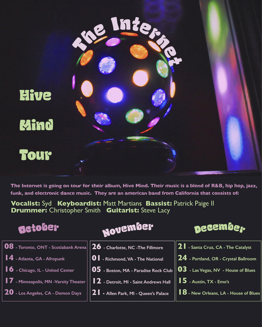
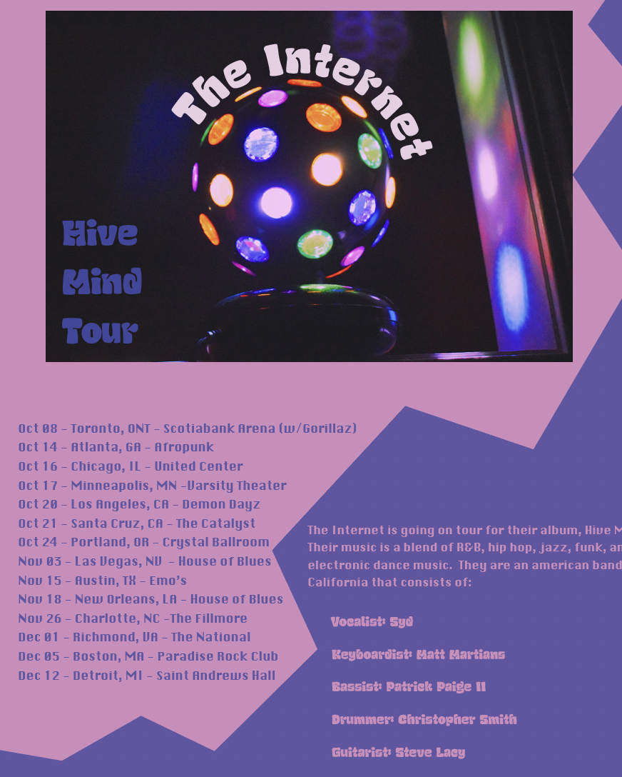
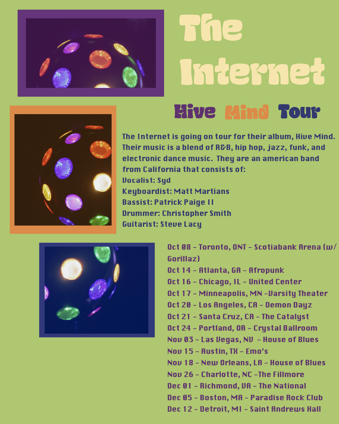
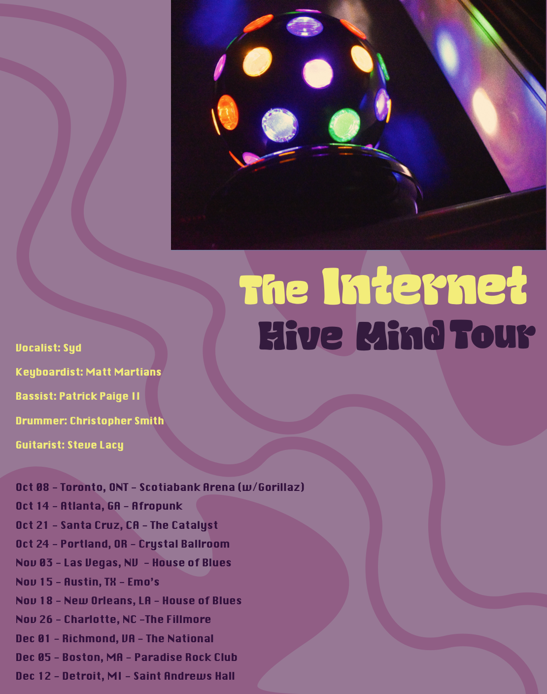
This project was very entertaining for me since I had the creative freedom to choose an event to create a poster for. I decided to design a poster for the Hive Mind Tour from the band, The Internet. They are a band I have seen and enjoy their groovy sound and theme. I designed three different compositions and made them groovy.
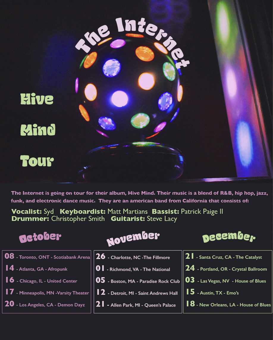
I was challenged to use our own photographs, so I took a bunch of pictures of a disco ball since it’s fitting to the band. After critiquing my poster I decided to make an all black poster so the image would blend in. I enjoyed playing with shapes, colors, and sizes of the text all over the poster. I aligned all the dates and made the title curve around the disco ball to add more to the design. I’m pleased with how this turned out.
Inspirations/Research
-
Inspiration
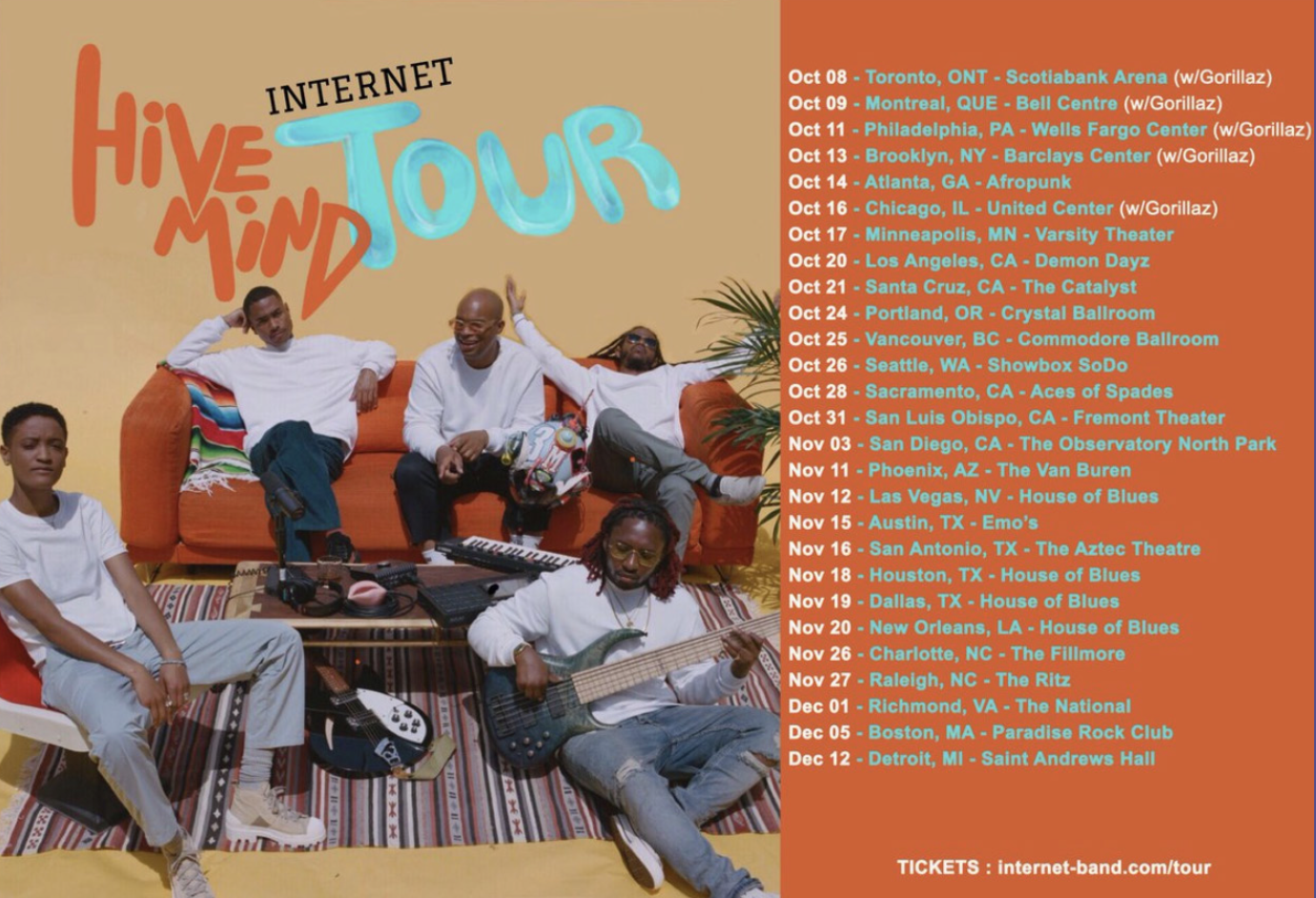
This is the original concert poster for The Internet band. I like the imagery as well as the bright colors they used. I wanted to insure my designs were just as groovy and bright.
-
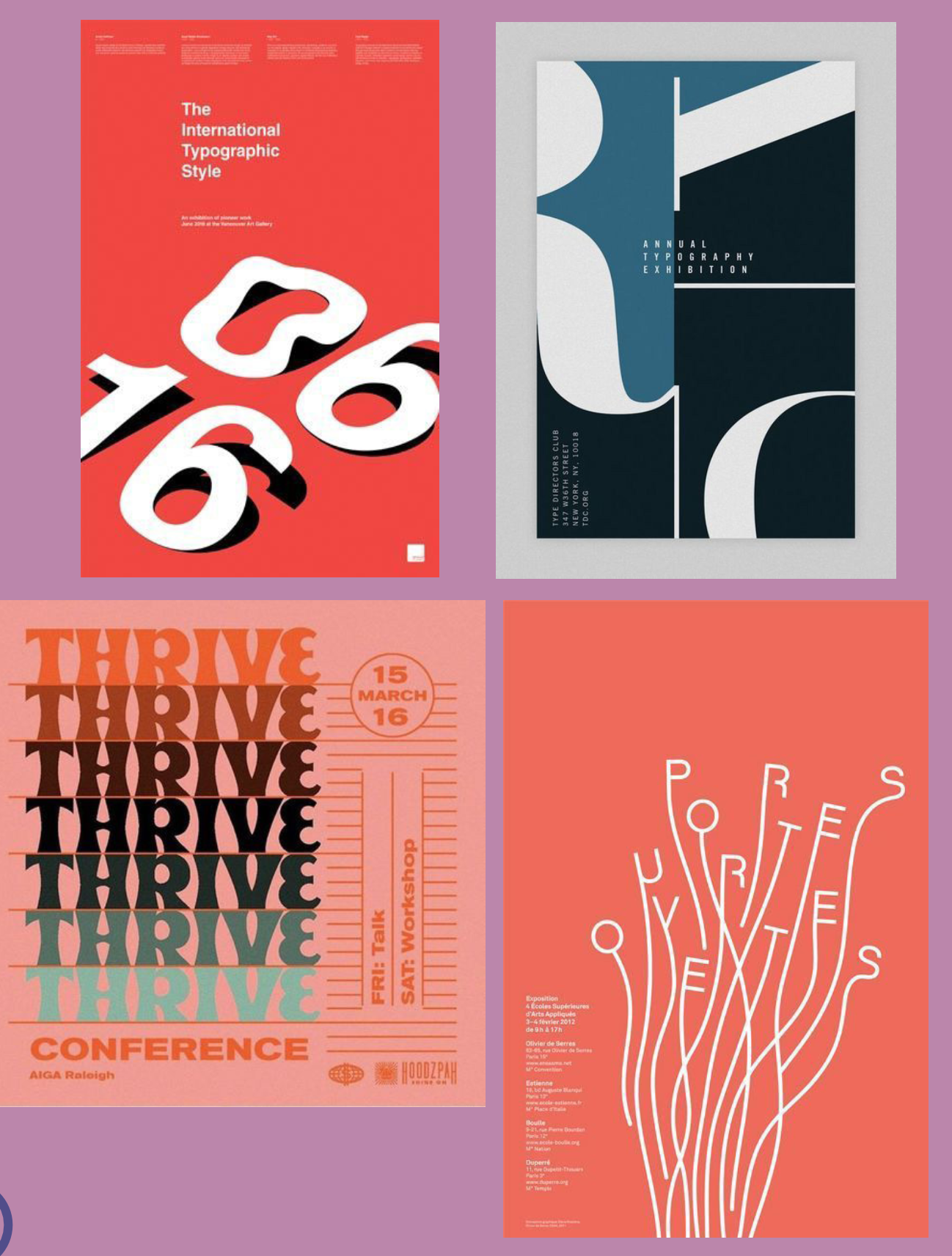
Research
I wanted to see what exists already regarding bright-colored posters. Headed to the internet and Pinterest and felt inspired by what I found.
-
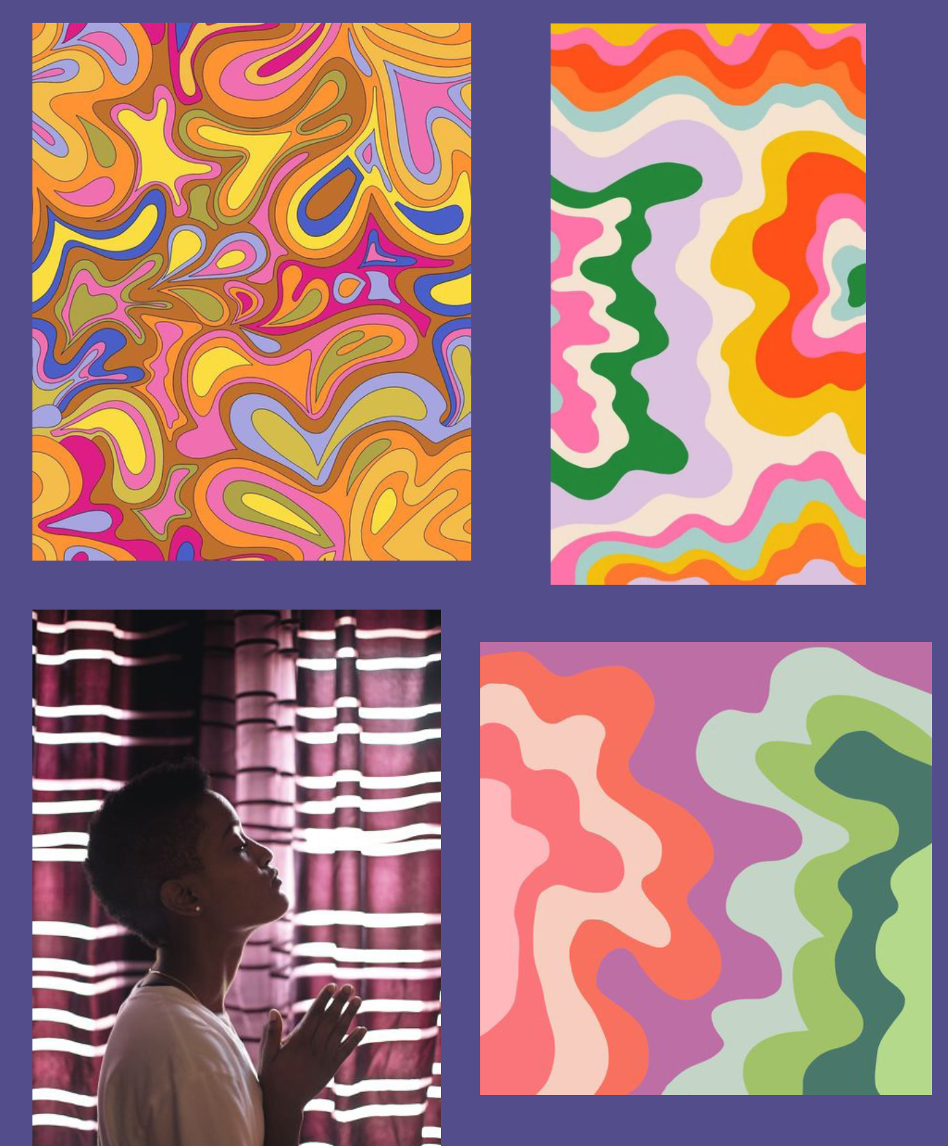
Research
I found more groovy patterns and an image of the band’s lead singer, Syd. I really admire their style which is why I resonate with them well. My liking of the band helped with my drive to create my posters.
-
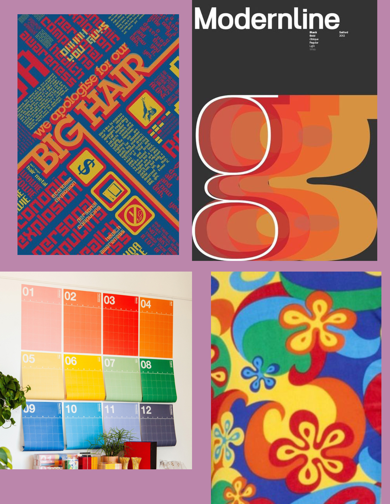
Research
Once again found more bright posters, patterns and calendars. At this point in my research I began truly visualizing what I wanted my 3 comps to look like.
Make it stand out.
-
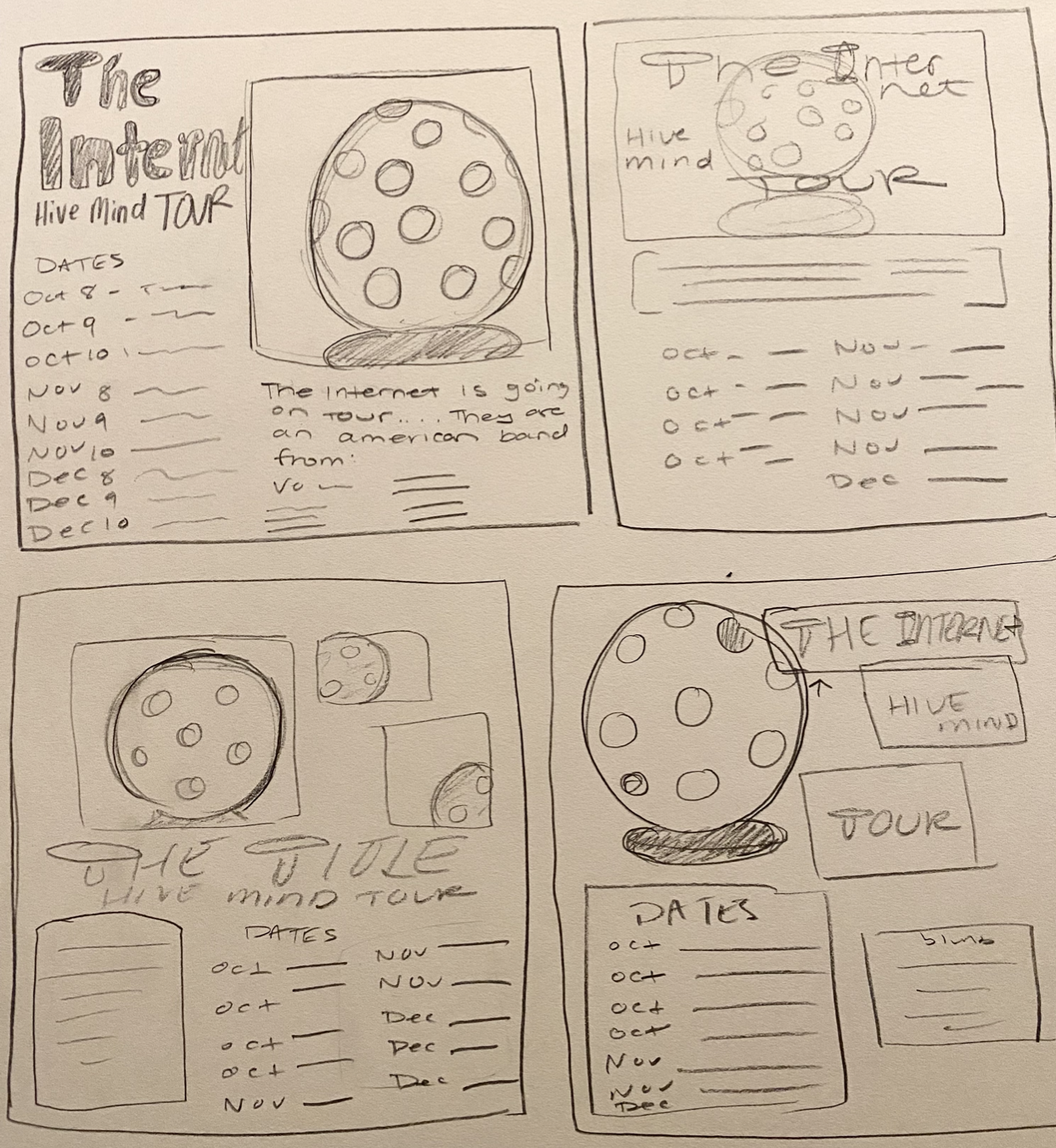
Sketches
I drew out some of my original ideas to bring the inspirations to paper. This made it easier to design since I could refer back to them as I went.
-
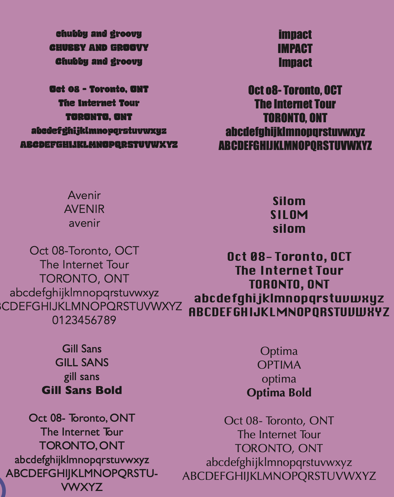
Text Studies
It all begins with an idea. Maybe you want to launch a business. Maybe you want to turn a hobby into something more. Or maybe you have a creative project to share with the world. Whatever it is, the way you tell your story online can make all the difference.
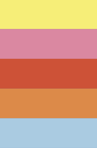
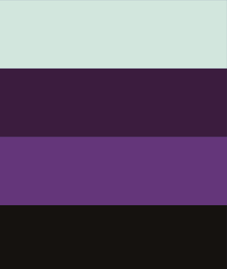

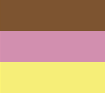




Above are my color studies where I played with variations to be able to visualize what color combos I could work with.
Below are my compositions and my final poster. I loved exploring the different options with the disco ball pictures I took. I am content with how all the posters came out.
Critique
A critique is a great way to receive constructive feedback on my compositions.They are a first try and my peers as well as my professor give me advice that they believe would make my work better.
I was told to use a different body font since I have to use a particular font from a selection for the class.
Another suggestion was to make the whole poster have a black background to match the picture.
I took these comments into consideration for my final comp.