It’s important to show where I came from starting college. At the time it may have seemed like stellar work, but there’s a lot I would change about it now. That, to me, shows my personal growth.
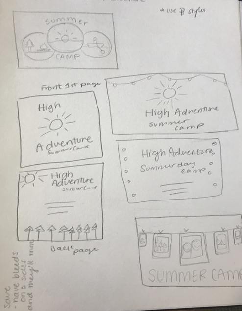
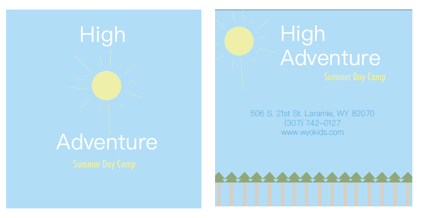
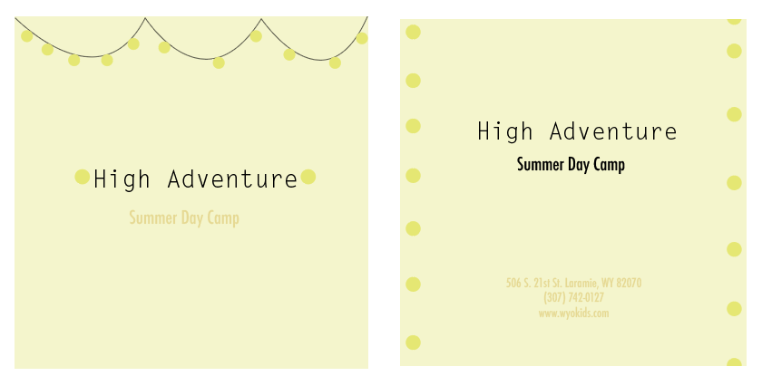
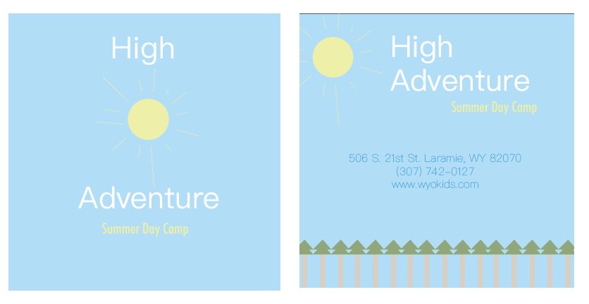
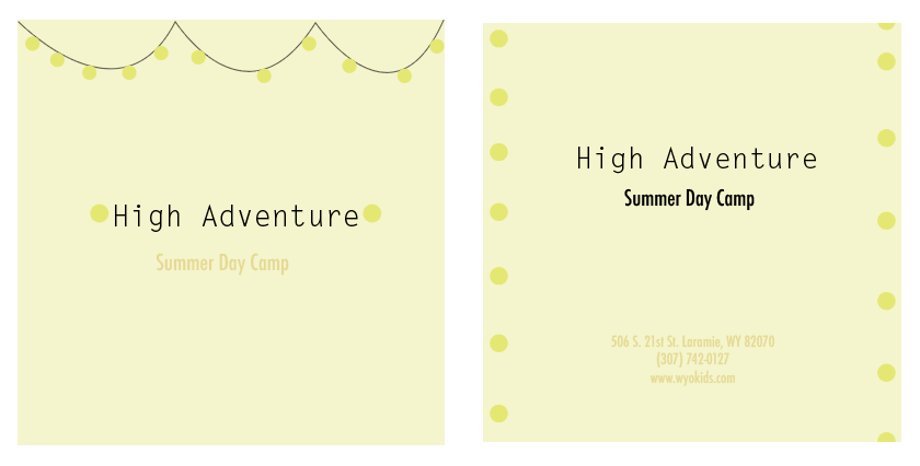
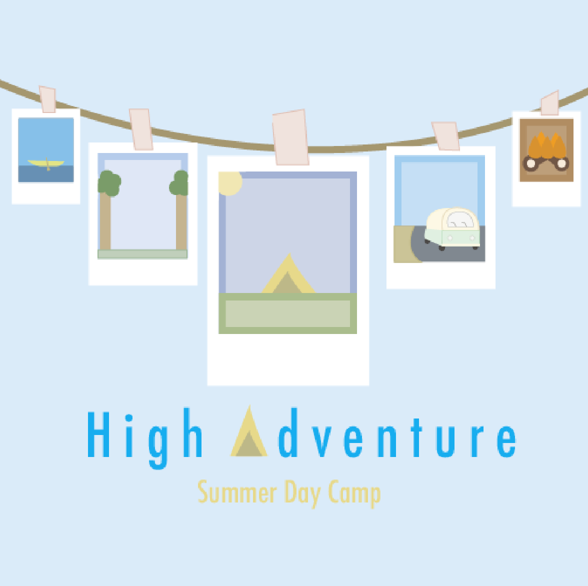
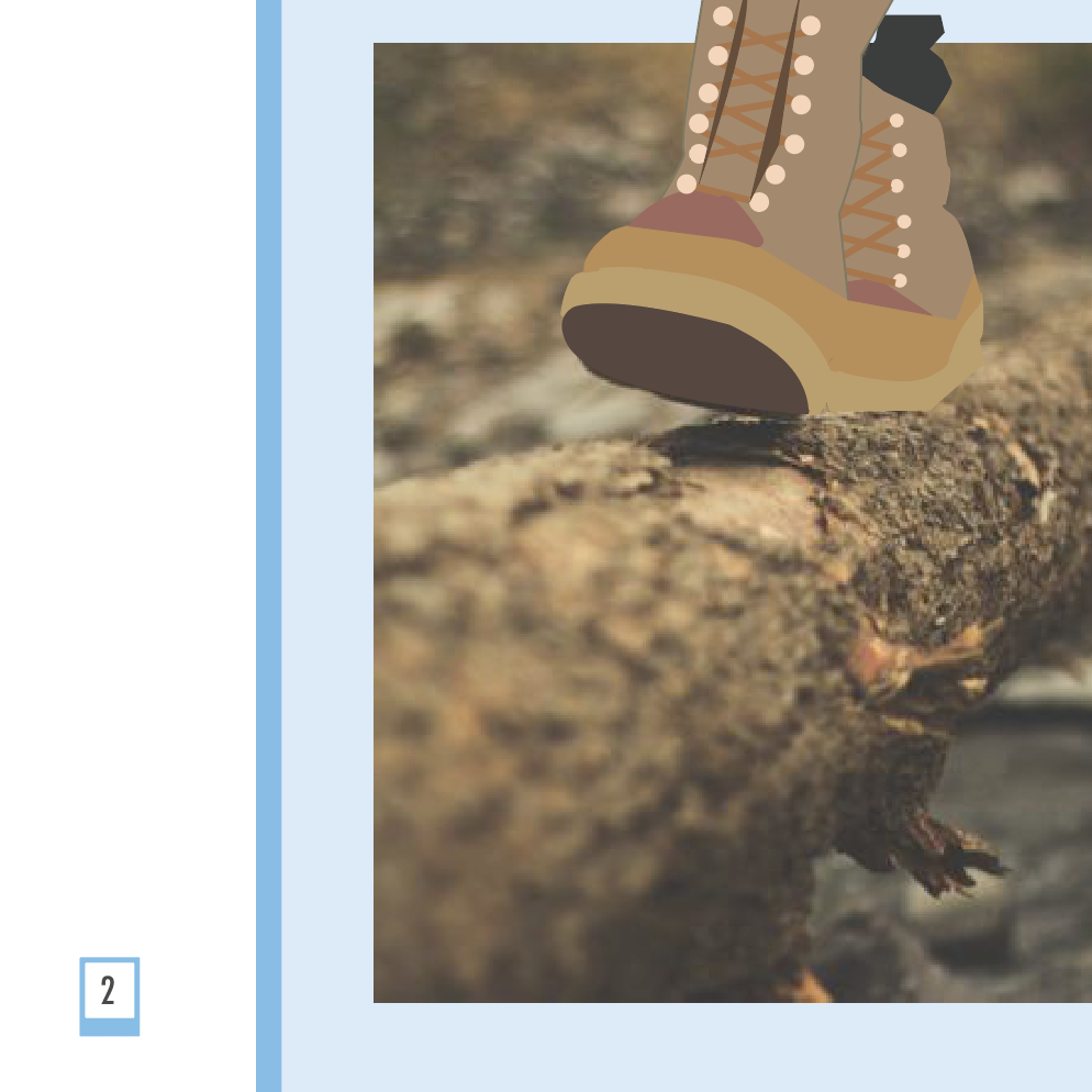
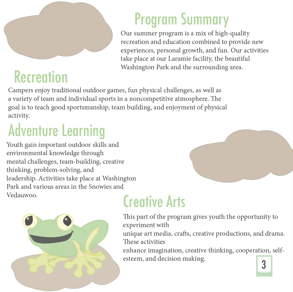
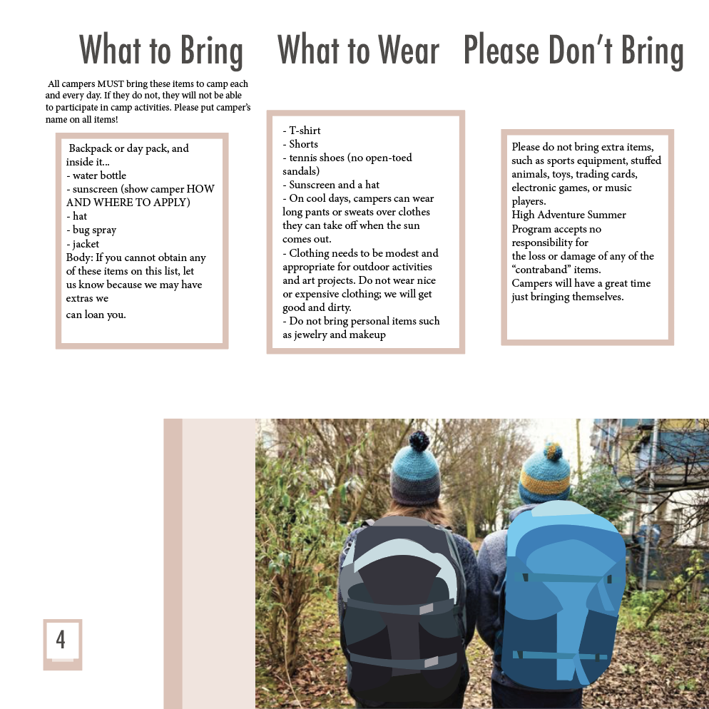
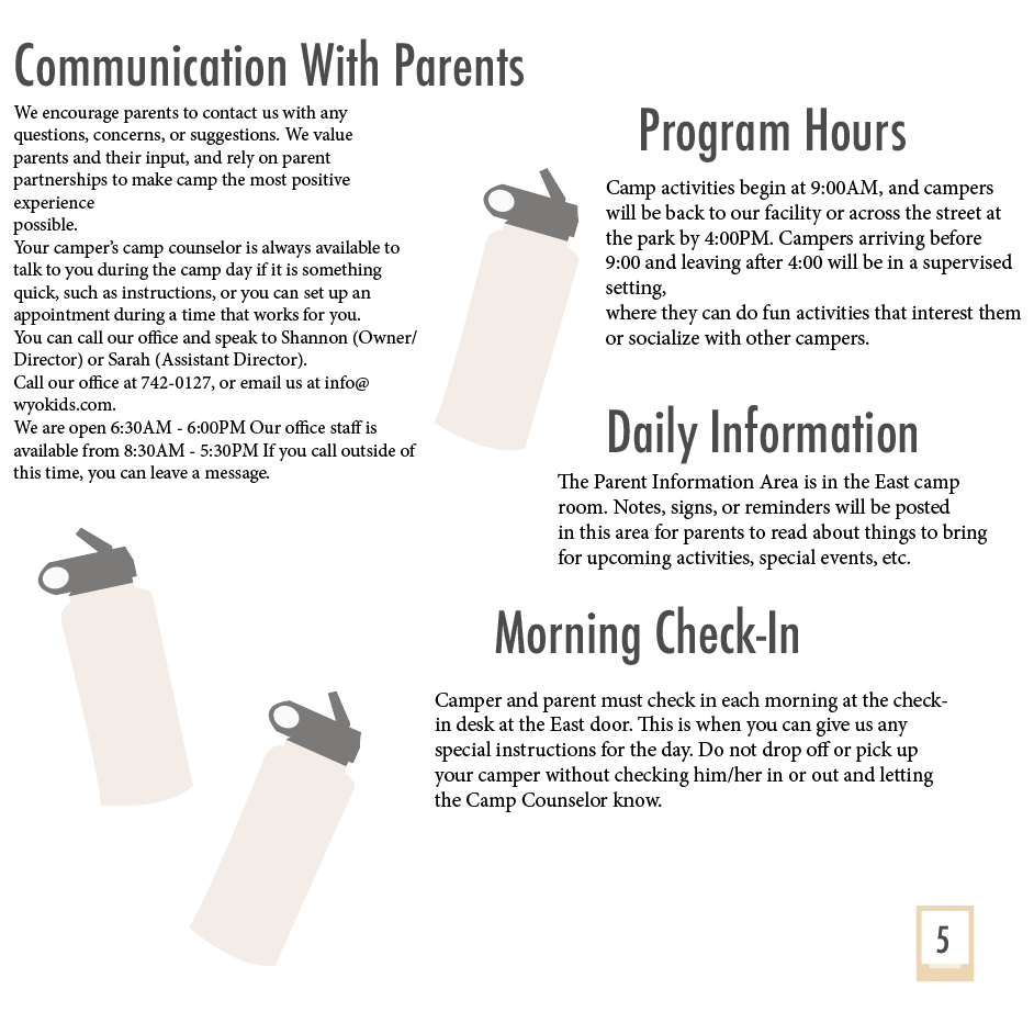
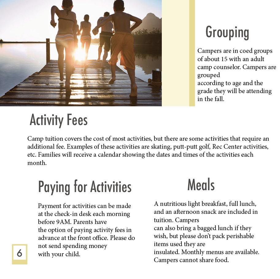
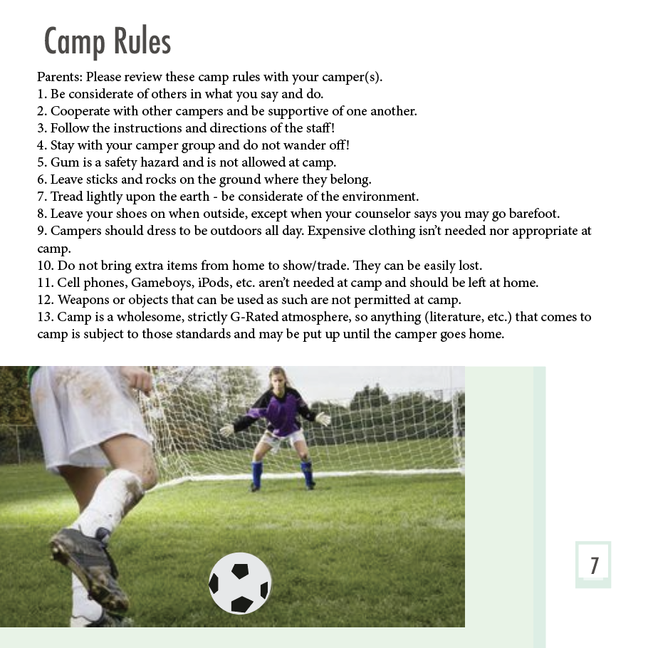
I designed a fictional brochure for a camp program. In order to do so I had to find a camp to base it off of to give it an authentic story and feel. I chose the High Adventure camp in Laramie, Wyoming. It’s a summer day camp that has nothing but good reviews. I started designing on Indesign and my personal goal was to create lots of illustrations and graphic elements throughout this assignment. I did so on adobe illustrator much like my other early projects. I created the cover to look like a handful of polaroid pictures hung on a garland of the camp activities.
I found lots of inspiration from the original site itself, and from scrolling on social media platforms. Honing into the camp brochure world. The audience is tailored to children and their parents, so I took that into consideration when selecting the colors and typefaces I wanted to use. I was excited when putting together the whole brochure and seeing the images and illustrations side by side.
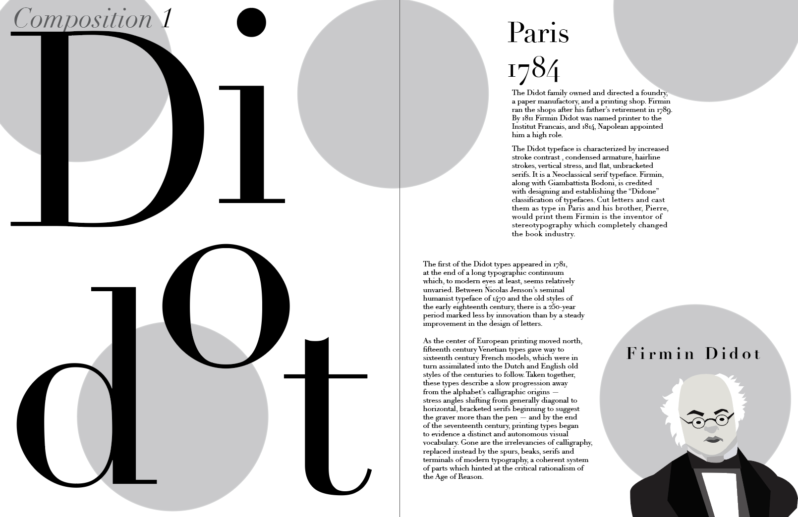
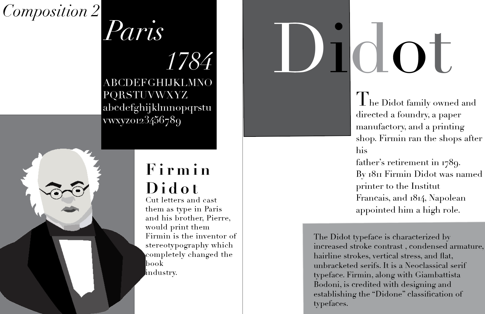
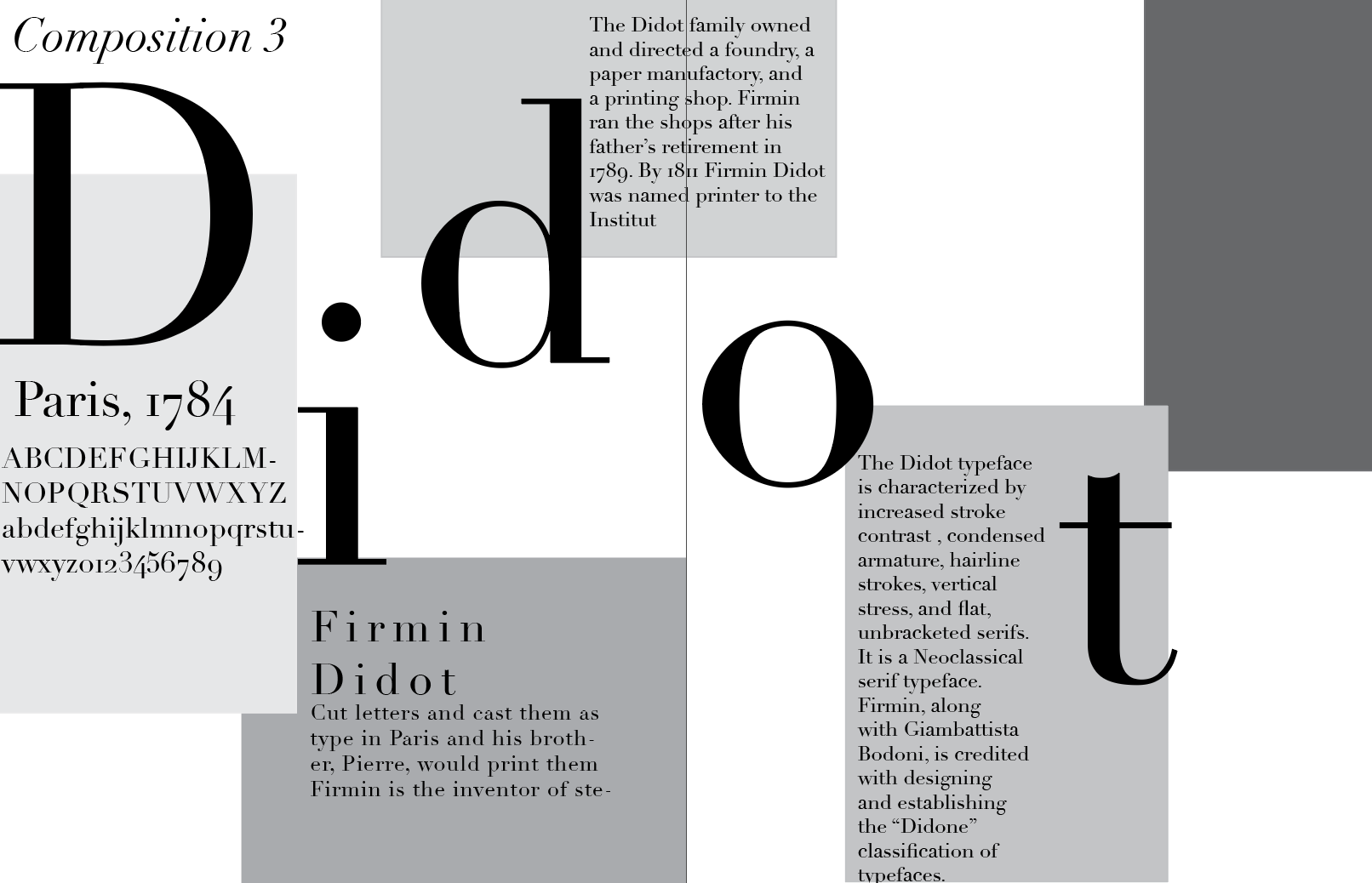
My second major project in my early work is the font study poster. The typeface I chose to study is the serif Didot. I was conditioned and started with creating a process book to fill with how I got from a blank canvas to the finished product. I did plenty of research on the typeface and its history.
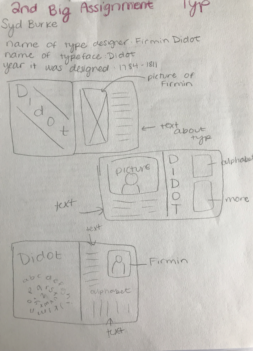
Then I perused Pinterest to see what previous designers have created with Didot. I then moved on to draw sketches of what I was imagining the poster to look like. I found an image of the creator of the typeface, Firmin Didot, and placed it into illustrator. Then I used my experience with the pen tool to create an illustration of the man.
Afterwards I created three different compositions with various shapes and styles. I wanted the palette to be black, white, and gray. I finished the project and chose this composition to be my favorite.
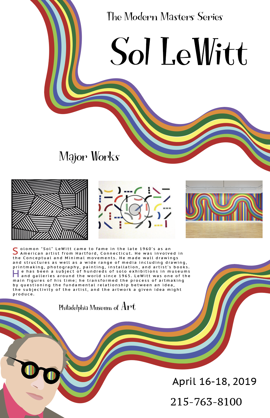
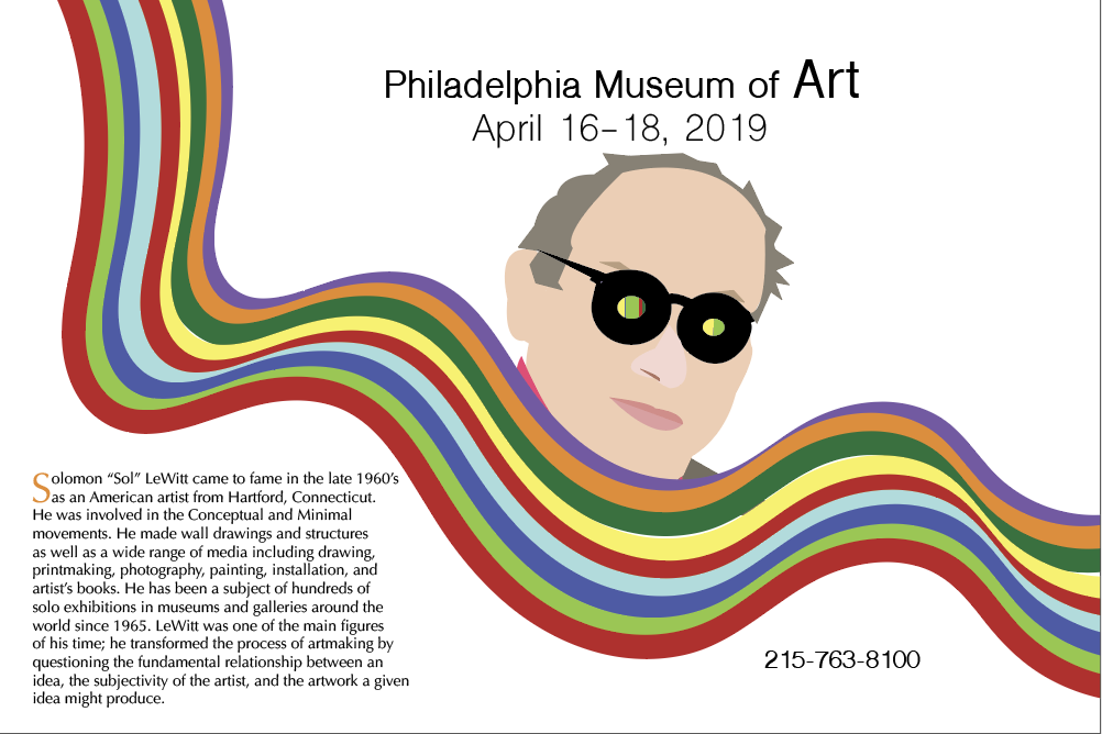
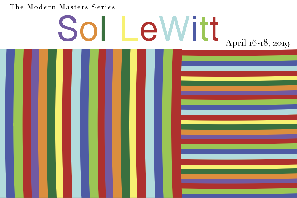
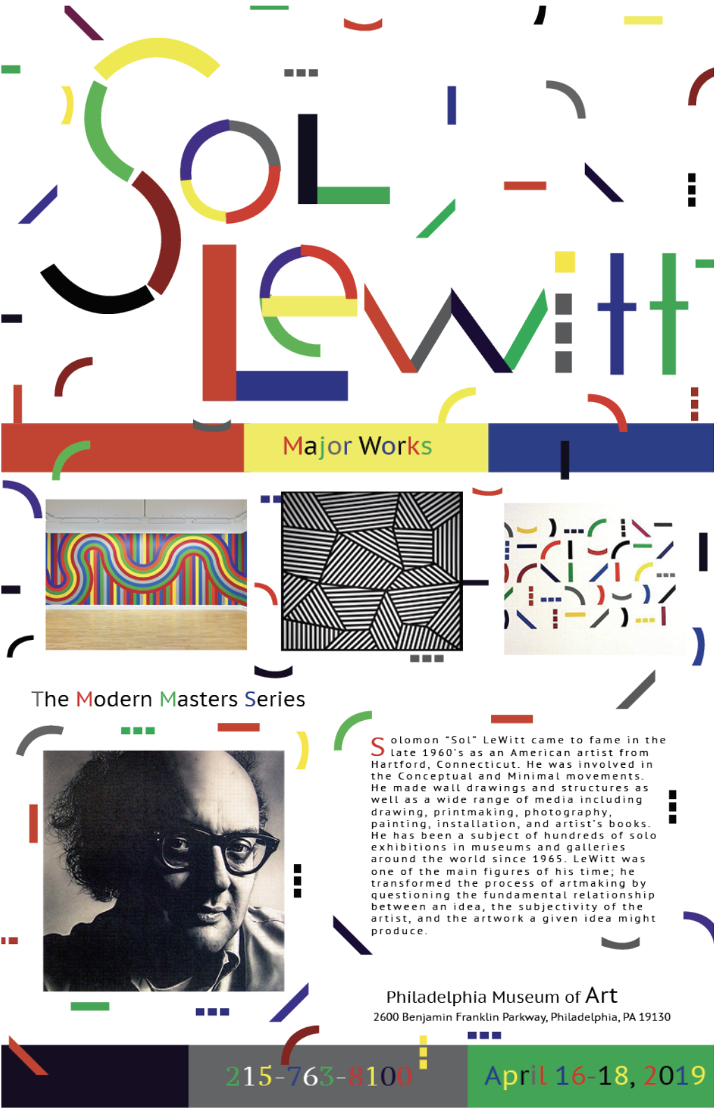
This venture is a project to successfully create a museum poster and a mini postcard for the show. I chose famous graphic designer, Sol Lewitt to study and base the design off of. I gravitated towards his style because I admire his use of shapes and bright color schemes. I absolutely was going to incorporate that into the final design.
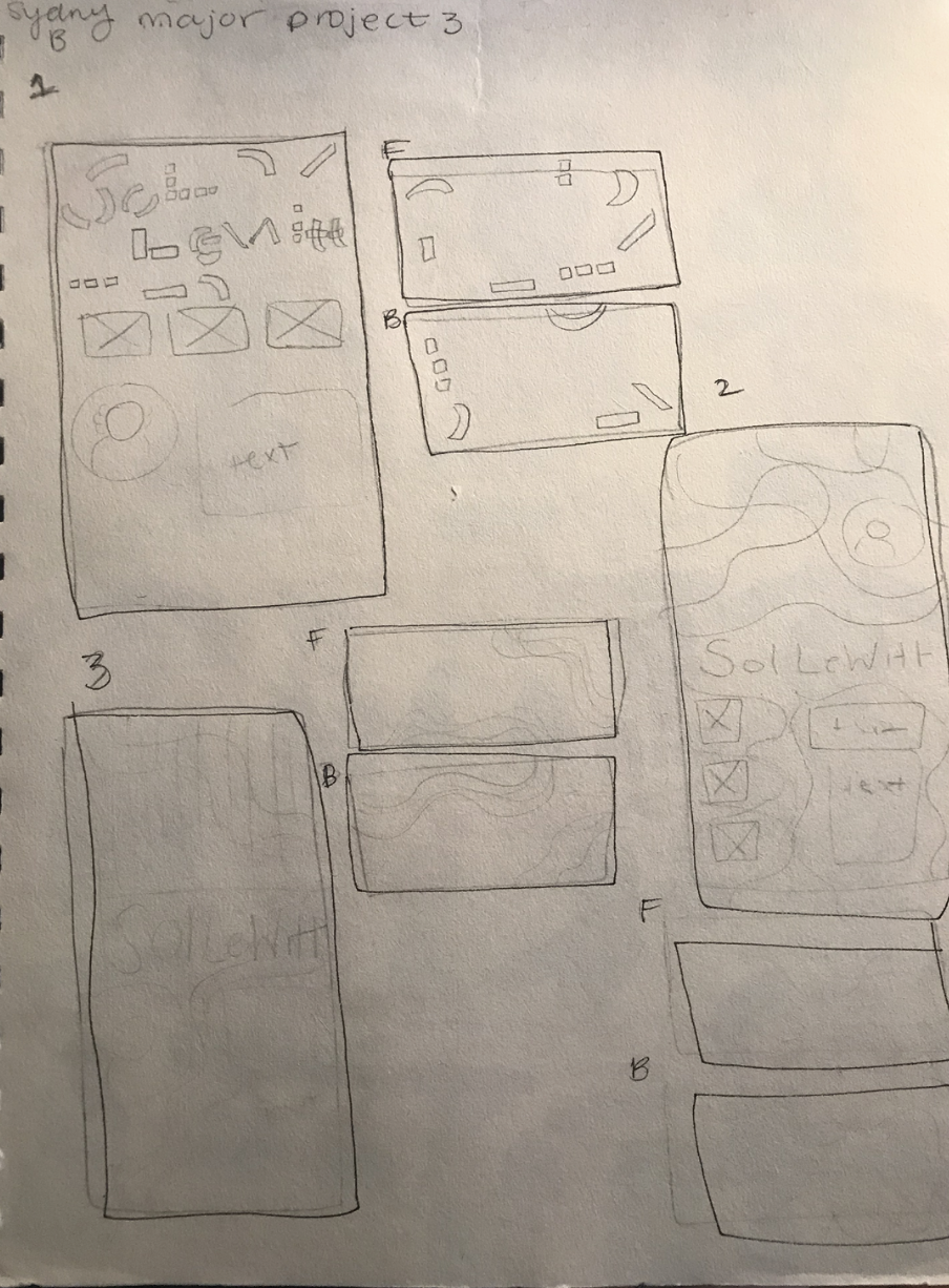
I designed three compositions with varying styles and designs to be the background to Sol’s major works and history. My final decision was my second composition since it wasn’t too crowded, like my other ones. Once again I utilized adobe illustrator and indesign to make this design possible. I found a suitable photograph of Sol Lewitt and illustrated it for both the poster and the mini card. I had a great time bringing all the pieces together since I had done lots of background research to prepare me for this. Within the research I was finding myself getting inspired from his successes and found it to be a breeze to get designing.

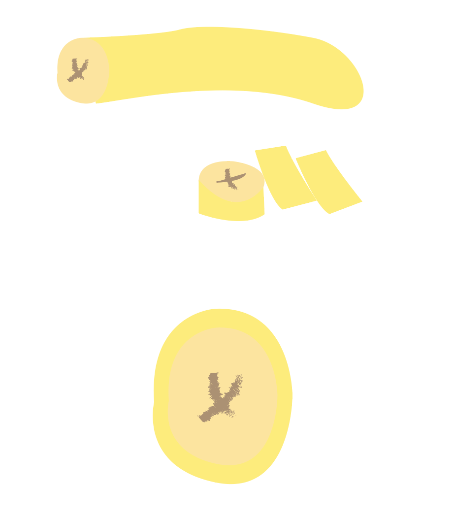
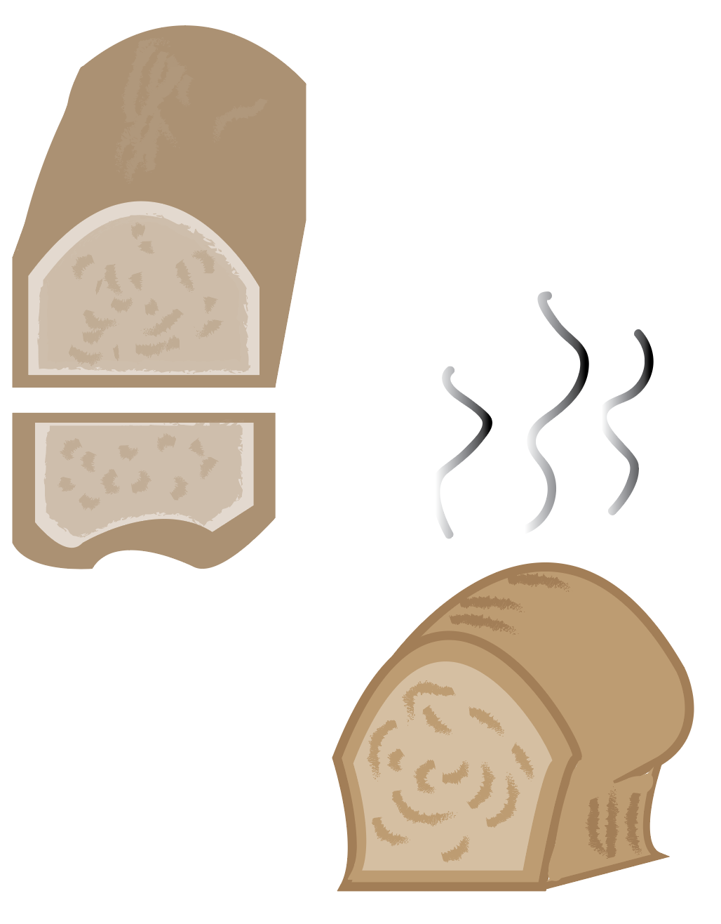
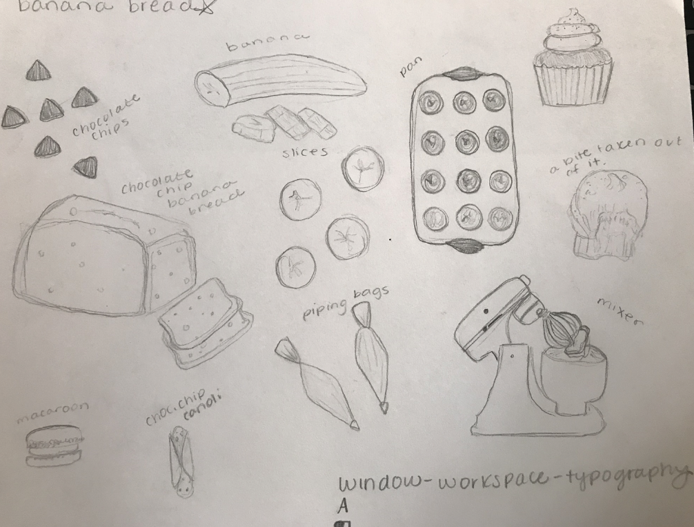
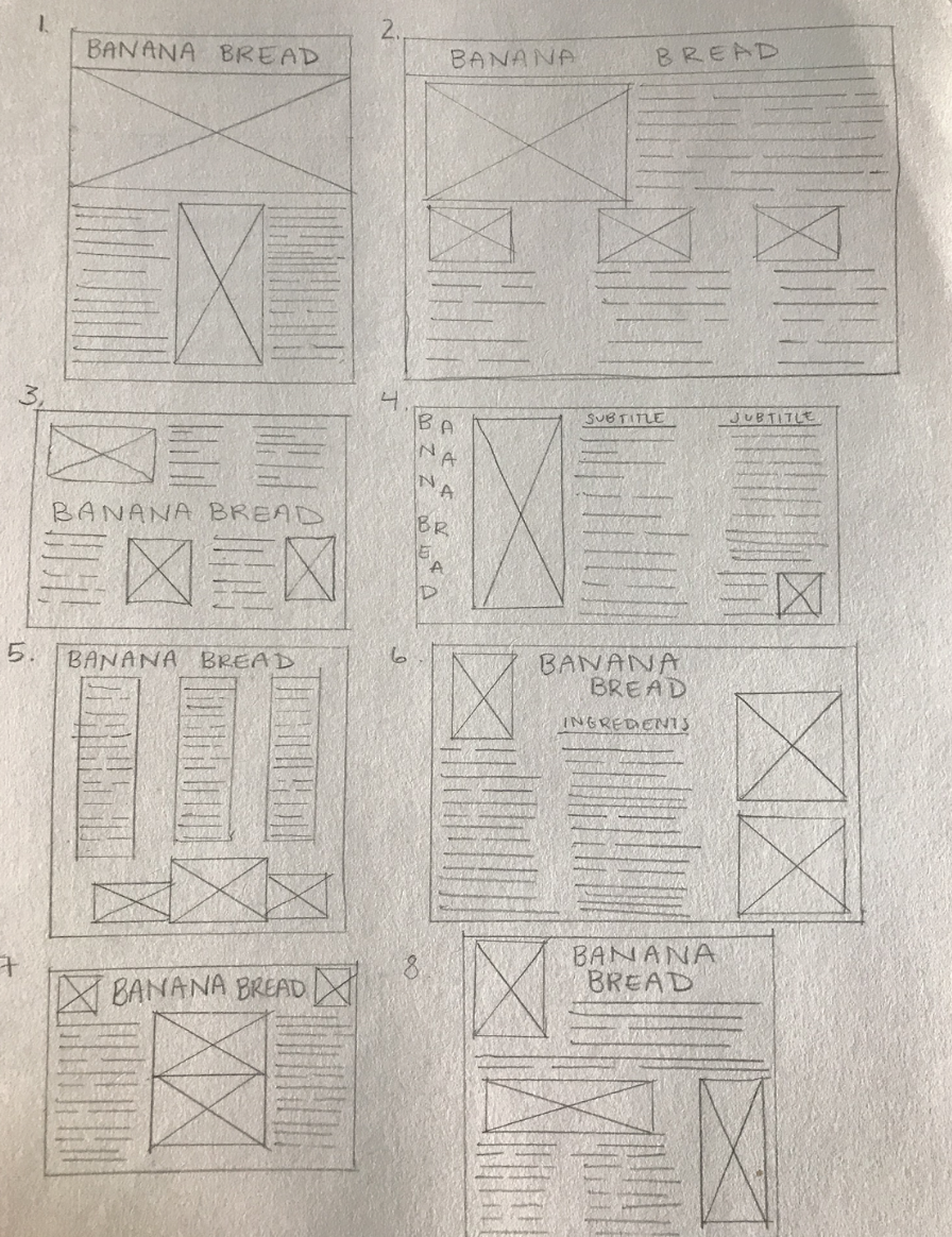
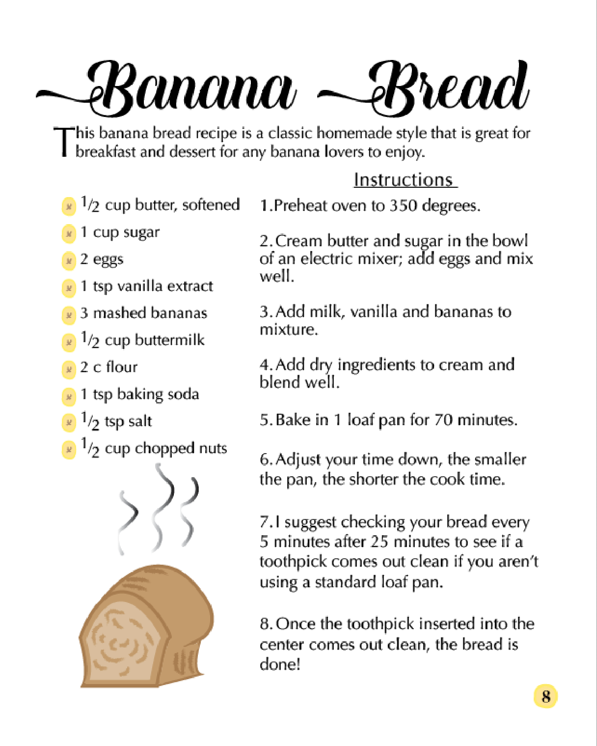
This Recipe card was her first typography assignment where I was told to make a recipe card and I chose a banana bread recipe. I designed this using Adobe Illustrator and Adobe Illustrator to create the visual.