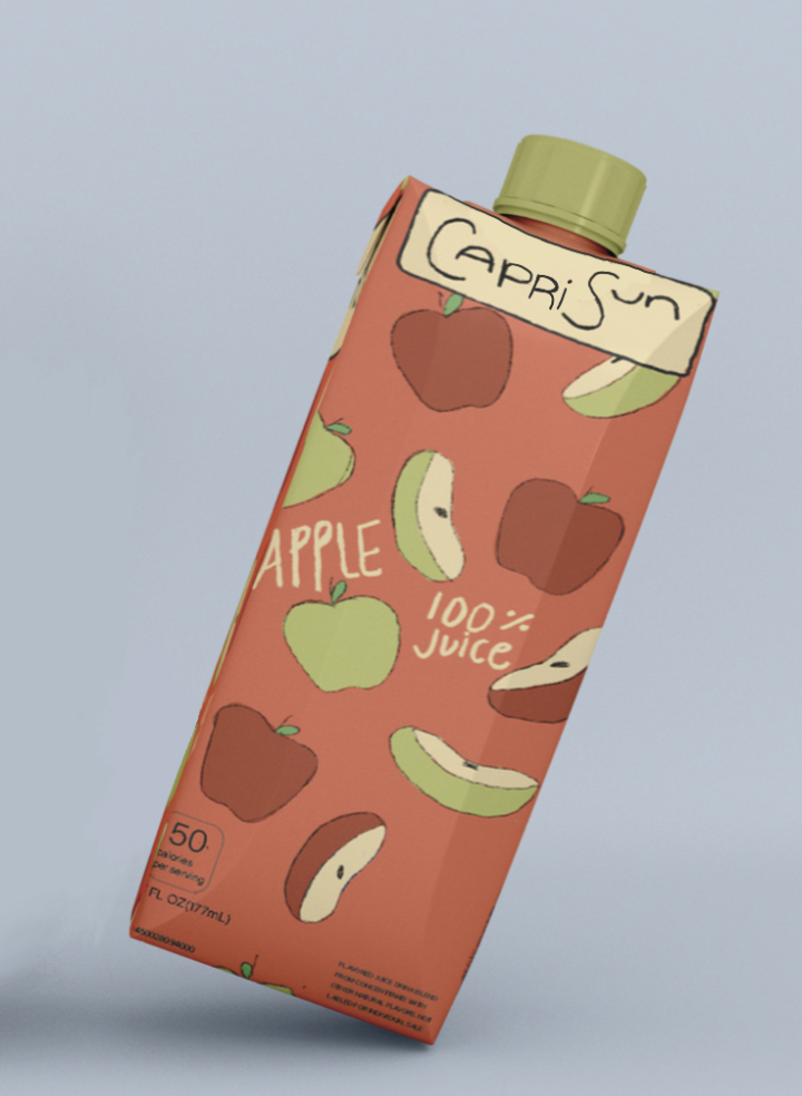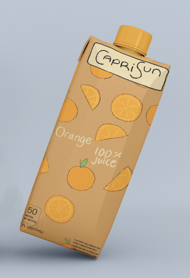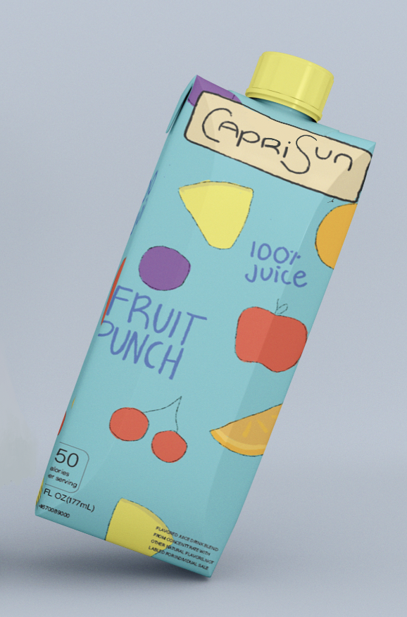

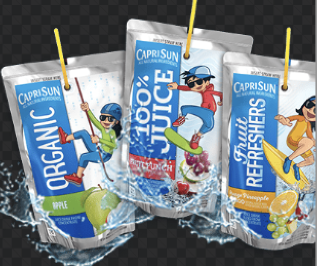
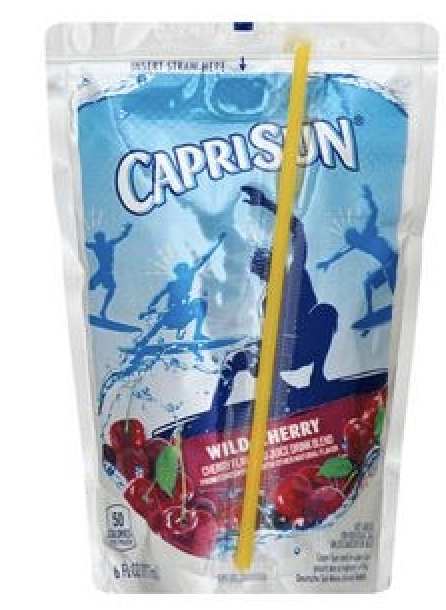
For this project I was tasked to brainstorm a brand’s design and give it a retouch in my style. The brand I chose was Capri Sun’s juice pouches. I wanted to create something that was more environmentally friendly and I decided to change them from pouches to cartons. I started by researching their designs over the years and how they approached different flavors. I decided to rework Apple, Orange, and Fruit Punch flavor.
The main demographic for CapriSun are children with their parents making the purchases. I wanted to give the redesign a minimalist, yet fun vibe. I made all of the designs and hand drew the font on procreate. I then transferred the designs on carton mock-ups with the help of Photoshop.
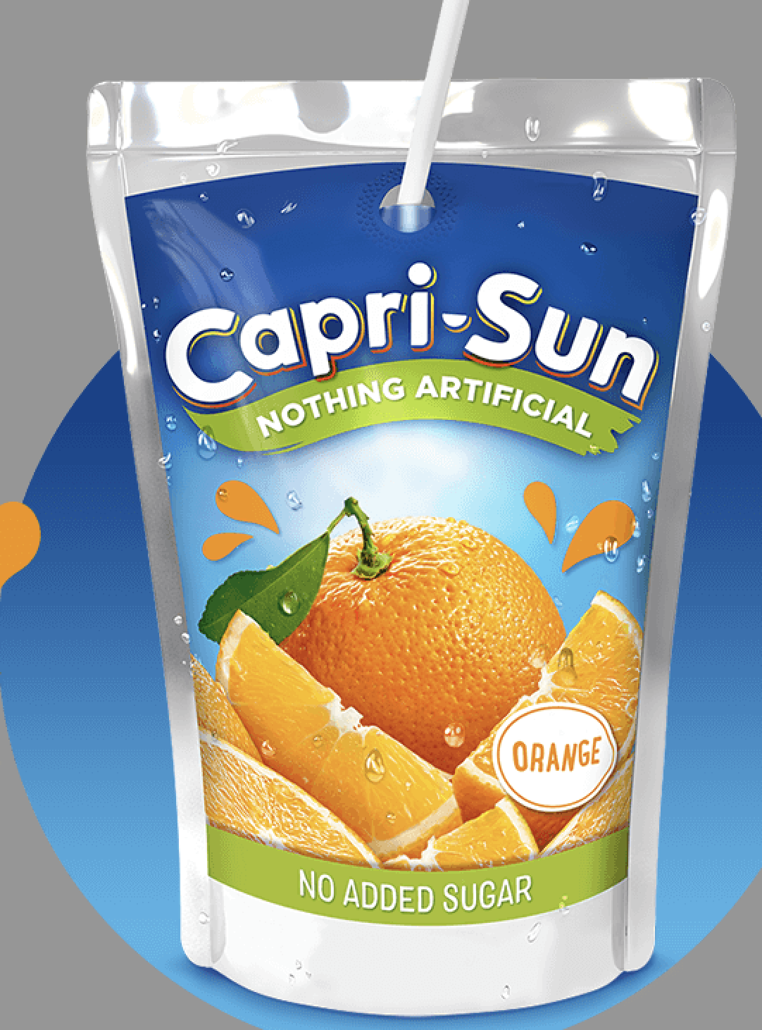

Original Sketches
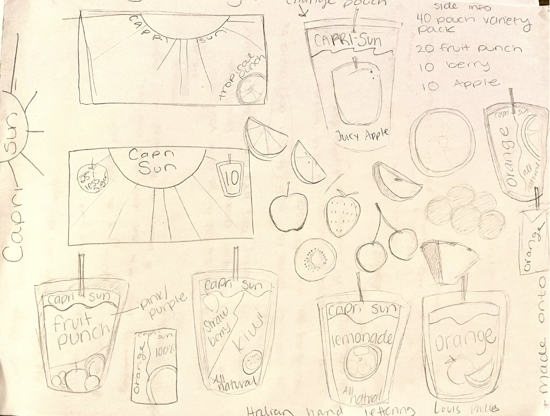
Took to my sketchbook to draw out my ideas of the pouches before I thought to do cartons instead.
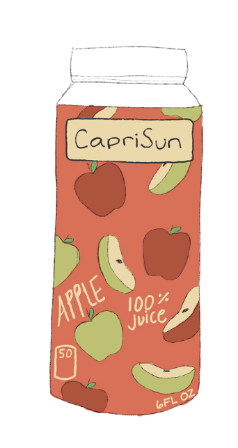
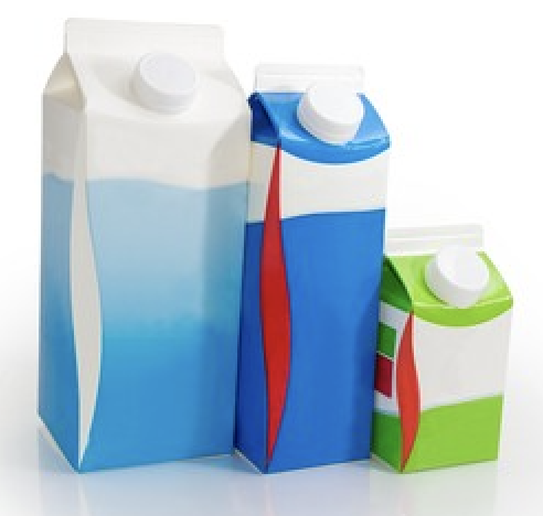
This is my initial vision and digital sketch for what I wanted the redesigned Capri-sun cartons to look like.
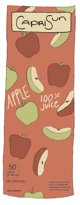
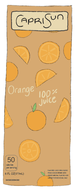
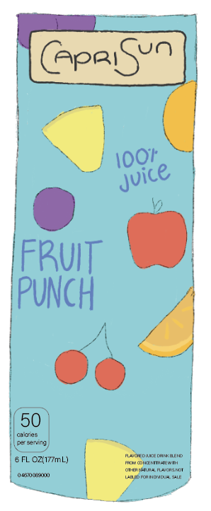
Above are the final digital sketches with the added nutritional information from Illustrator. Afterwards I added them to the desired mock up file through Photoshop.
Below are the final mockups of the Capri-sun cartons. Unique, colorful and fun are the words that come to mind when I image these cartons on the refrigerated shelves in a store. I chose to make the apple and fruit punch caps a different color than the background for an added flare.